
RealSelf
RealSelf is the world's largest online community of user generated content for elective treatments, attracting 10 million unique users a month. Users of the site write treatment reviews, ask questions of doctors, and share photos of their experiences. RealSelf is backed by Rich Barton (founder of Zillow and Expedia), early Microsoft investor Mike Slade, and Barney Harford (CEO of Orbitz).

My Role
While at RealSelf, I led all major site improvements as the sole designer for ten Developers and four Product Managers. I took a data-driven, mobile-first approach and collaborated with teams across all disciplines to create great user experiences for our users while meeting all business goals. Below are some of the projects that I worked on.


User Journey Map
Users can take one of several journeys while using our product. First, they may come in through an organic search and just dip their toe in the water, while others might research procedures on our platform but never contact a doctor. A complete user journey, however, involves researching procedures, choosing a procedure to have, researching doctors, selecting a doctor to perform the procedure, and then having the procedure. This User Journey Map helped my team to have a clear and documented understanding of the users' journey and identify the key points at which users will be looking for doctors. Beyond the doctor profile, I have used this document to identify best opportunities for touch points, and areas on the site as well as moments in the user lifecycle that RealSelf may not be fulfilling the users' need as effectively as it could.

Personas
RealSelf's consumer users are primarily women, from 18 to mid-50s looking to get a cosmetic procedure. Over 70% of users are on mobile. RealSelf also has doctor users, who provide the company's revenue, so it was necessary to balance the competing needs between the two user groups.


Doctor Profile
PROBLEM STATEMENT
RealSelf has both free and paid versions of the doctor profile, the latter being one of the primary sources of revenue for the company. These two types of profiles had no visual differentiation. I also knew from user feedback that RealSelf wasn't providing a clear path to the information its users needed to make their decision in choosing a doctor. How could I increase doctor profile sales, provide better information to users, and increase leads to doctors?
CUSTOMER INSIGHTS AND IDEATION
I partnered with a Product Manager on this project from start to finish. I began with user interviews, surveys, and roundtable discussions with users to learn more about how they were finding doctors and what they most wanted to know to be able to make an informed decision. I also listened in on sales calls to doctors to see what was most important to them, and interviewed members of our doctor sales team. I needed to meet the goals of the business and the goals of our users.
OUTCOME
The new doctor profile design resulted in increased doctor PRO sales, more than doubling the sales in the first month after launch. I increased consumer contacts to doctors by 5% and as part of the doctor roll-out plan, I introduced a gamification component for new doctors that increased their answers on the site by 28% and overall engagement by 4%.


Doctor Finder
PROBLEM STATEMENT
The doctor finder landing page was a browse-style drill down that required users to click through multiple pages before being shown any search results. The page was text-heavy and hard to use, especially on mobile. Once users finally did reach the results page, they were only shown doctors that had answered questions.
CUSTOMER INSIGHTS AND IDEATION
For the doctor finder, I partnered with a Product Manager and I worked on it from start to finish. I had a lot of qualitative data from my doctor profile interviews and surveys. I looked to best practices for search and filtering and did an analysis of how other similar medical sites were using search, as well as different patterns on e-commerce sites. One of the first changes I made was to show all doctor results, regardless of engagement. I knew from talking to the users that whether or not a doctor had answered questions on the site didn't factor into their decision in choosing a doctor. I knew this change would help us to be the trusted source in finding and locating a cosmetic surgeon that would meet the user's needs and would also help doctor finder SEO.
I introduced a search bar to the doctor finder page using elastic search which detected the user's location so they would not have to select it themselves, helping to reduce the number of clicks it took to get to doctor results.
I added basic filters and sorting capabilities so users could select their doctors by what was most important to them. I surfaced distance to the user, which was important for minimally invasive users, reviews, and any special offers the doctor had. To accommodate for increased revenue, I added doctor ads to the top of the search as well and a paid filter that would allow users to filter by certain products the doctor offered.
OUTCOME
Overall, I increased doctor leads by 10% and increased doctor profile views by 4%. The changes received positive verbatim feedback from doctors, users and a very thrilled sales team.

These wireframes show the possible flows between search and browse, the results page, autocomplete, and the no results page.


Visual Browse
THE PROBLEM
I worked with a PM partner on this project to create a better browsing experience for our reviews. Consumer reviews are the heart of the business. They are the content that the invested users are here to see and they convert. Individual reviews have the second-highest page impressions by type, and the second highest click-through-rate for doctor ads. I set out to create a simpler browsing experience that would increase click-through on reviews, leading to more overall pageviews.
DATA INPUTS
To get started, I looked at existing regression calculations to see what meta data correlated to review pageviews. I looked to survey data to see what users self-reported about what was most important to them when reading reviews. With this information in hand, I began sketching to get out as many ideas as I could. How should the information be displayed? What is the best information to display? What do users care most about at different points in their journey? How can we reduce the information down to the most salient points?
From there I chose 5 sketches and made hi-fidelity versions to show to our users with different review details shown on each. We first had them conduct a card-sorting exercise to see which review details were most important to them and then we showed them designs with different configurations of review details shown on each one. This helped us narrow it down to two versions which is in the queue to be A/B tested.


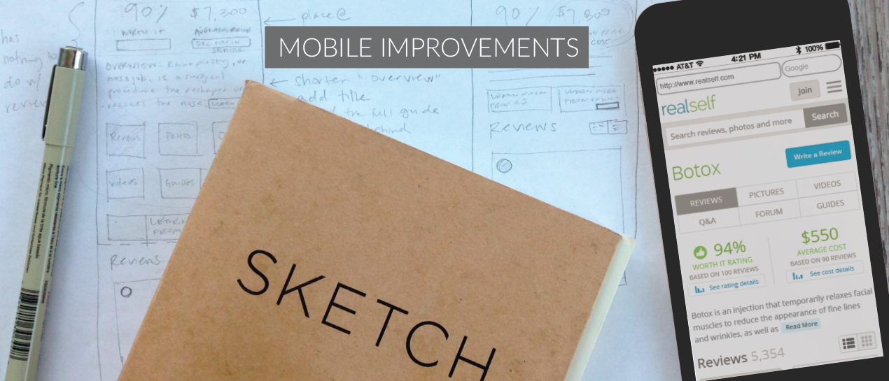
Mobile Improvements
This is a quick design study that I did to increase exposure of the content above the fold on our treatment pages. I redid the in-page navigation, removing the tabbed layout so our users could see all of our available content selections at a glance. I knew from talking to users that the hardest thing for them to find was cost information, so I gave that a more prominent location. While I was experimenting with different concepts, I created paper prototypes to play with the ideas. The catalyst for these improvements were to give the native ads from our industry partners more impressions and therefore to provide more opportunities for revenue.

To convey my ideas, I created paper prototypes from my sketches to better demonstrate what some of the changes would feel like compared to existing screens. I showed these to stakeholders during an initial brainstorming session to quickly and easily convey some of my concept ideas.
