
Visual Browse
My Role
I was the sole UX and visual designer on the visual browse project. I worked with one product manager and a UX researcher.
Problem Statement
Consumer reviews are the heart of RealSelf's business. They are the content that most users are here to see and they convert. Individual reviews have the second-highest page impressions by type, and the second highest click-through-rate for doctor ads. I set out to create a simpler browsing experience that would increase click-through on reviews, leading to more overall pageviews.
Data Inputs
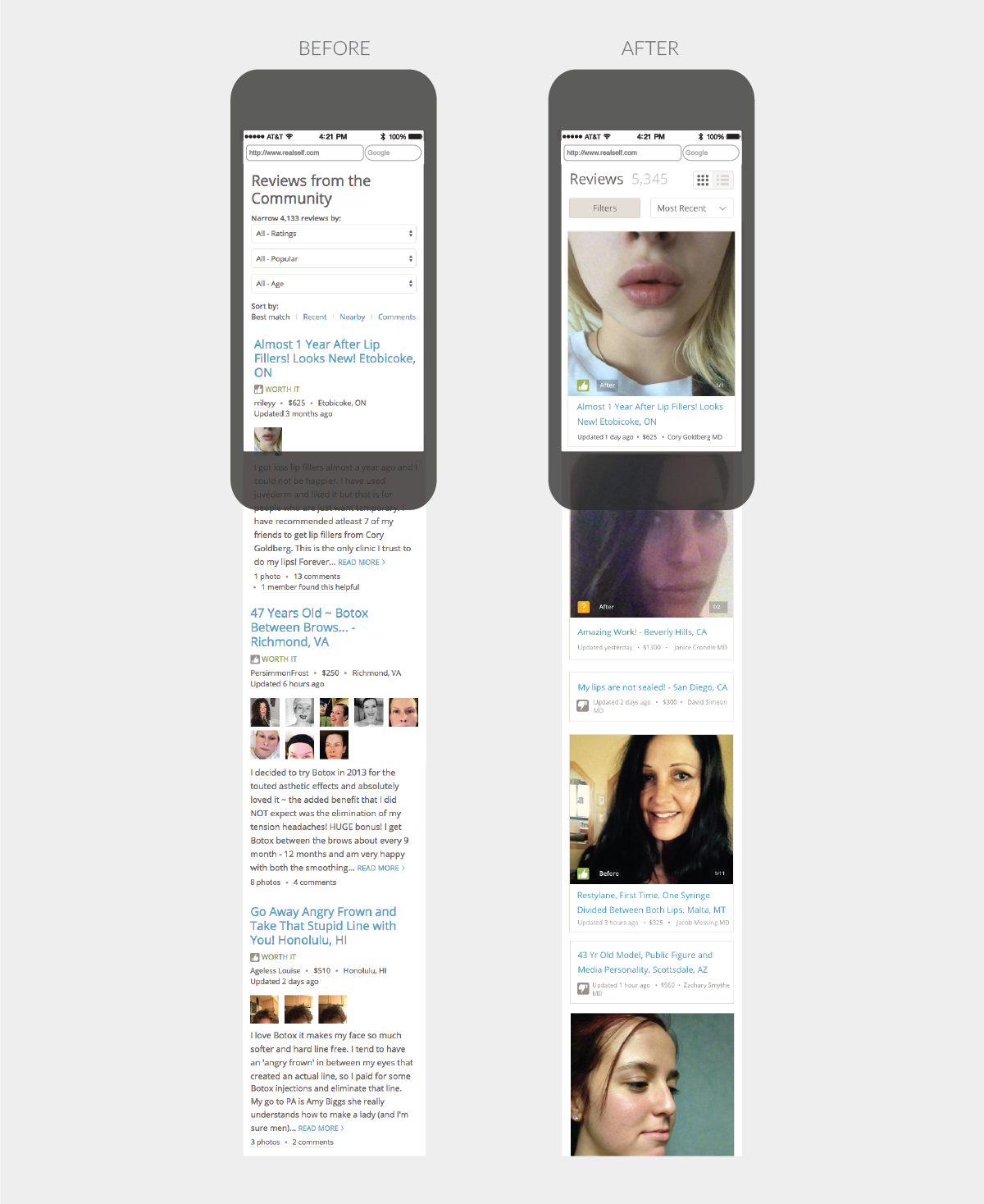
To get started, I looked at existing regression calculations to see what meta data correlated to review pageviews. I looked to survey data to see what users self-reported about what was most important to them when reading reviews. With this information in hand, I began sketching to get out as many ideas as I could. How should the information be displayed? What is the best information to display? What do users care most about at different points in their journey? How can we reduce the information down to the most salient points?
From there I chose 5 sketches and made hi-fidelity versions to show to users. Each image had different review details. I had users conduct a card-sorting exercise to see which review details were most important to them and then we showed them designs with different configurations of review details shown on each one. This helped us narrow it down to two versions. This feature improvement has not been testing yet.