Street Address
City, State, Zip
Phone Number
Sarah Durkee
Your Custom Text Here

Work
— I am a UX Designer in Seattle. I used to do UX for cities and now I do it for screens.

Your Custom Text Here
— I am a UX Designer in Seattle. I used to do UX for cities and now I do it for screens.
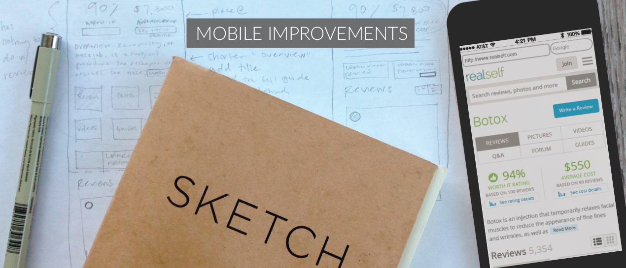
RealSelf is the world's largest online community of user generated content for elective treatments, attracting 10 million unique users a month. Users of the site write treatment reviews, ask questions of doctors, and share photos of their experiences. RealSelf is backed by Rich Barton (founder of Zillow and Expedia), early Microsoft investor Mike Slade, and Barney Harford (CEO of Orbitz).
While at RealSelf, I led all major site improvements as the sole designer for ten Developers and four Product Managers. I took a data-driven, mobile-first approach and collaborated with teams across all disciplines to create great user experiences for our users while meeting all business goals. Below are some of the projects that I worked on.
Users can take one of several journeys while using our product. First, they may come in through an organic search and just dip their toe in the water, while others might research procedures on our platform but never contact a doctor. A complete user journey, however, involves researching procedures, choosing a procedure to have, researching doctors, selecting a doctor to perform the procedure, and then having the procedure. This User Journey Map helped my team to have a clear and documented understanding of the users' journey and identify the key points at which users will be looking for doctors. Beyond the doctor profile, I have used this document to identify best opportunities for touch points, and areas on the site as well as moments in the user lifecycle that RealSelf may not be fulfilling the users' need as effectively as it could.
RealSelf's consumer users are primarily women, from 18 to mid-50s looking to get a cosmetic procedure. Over 70% of users are on mobile. RealSelf also has doctor users, who provide the company's revenue, so it was necessary to balance the competing needs between the two user groups.
PROBLEM STATEMENT
RealSelf has both free and paid versions of the doctor profile, the latter being one of the primary sources of revenue for the company. These two types of profiles had no visual differentiation. I also knew from user feedback that RealSelf wasn't providing a clear path to the information its users needed to make their decision in choosing a doctor. How could I increase doctor profile sales, provide better information to users, and increase leads to doctors?
CUSTOMER INSIGHTS AND IDEATION
I partnered with a Product Manager on this project from start to finish. I began with user interviews, surveys, and roundtable discussions with users to learn more about how they were finding doctors and what they most wanted to know to be able to make an informed decision. I also listened in on sales calls to doctors to see what was most important to them, and interviewed members of our doctor sales team. I needed to meet the goals of the business and the goals of our users.
OUTCOME
The new doctor profile design resulted in increased doctor PRO sales, more than doubling the sales in the first month after launch. I increased consumer contacts to doctors by 5% and as part of the doctor roll-out plan, I introduced a gamification component for new doctors that increased their answers on the site by 28% and overall engagement by 4%.
PROBLEM STATEMENT
The doctor finder landing page was a browse-style drill down that required users to click through multiple pages before being shown any search results. The page was text-heavy and hard to use, especially on mobile. Once users finally did reach the results page, they were only shown doctors that had answered questions.
CUSTOMER INSIGHTS AND IDEATION
For the doctor finder, I partnered with a Product Manager and I worked on it from start to finish. I had a lot of qualitative data from my doctor profile interviews and surveys. I looked to best practices for search and filtering and did an analysis of how other similar medical sites were using search, as well as different patterns on e-commerce sites. One of the first changes I made was to show all doctor results, regardless of engagement. I knew from talking to the users that whether or not a doctor had answered questions on the site didn't factor into their decision in choosing a doctor. I knew this change would help us to be the trusted source in finding and locating a cosmetic surgeon that would meet the user's needs and would also help doctor finder SEO.
I introduced a search bar to the doctor finder page using elastic search which detected the user's location so they would not have to select it themselves, helping to reduce the number of clicks it took to get to doctor results.
I added basic filters and sorting capabilities so users could select their doctors by what was most important to them. I surfaced distance to the user, which was important for minimally invasive users, reviews, and any special offers the doctor had. To accommodate for increased revenue, I added doctor ads to the top of the search as well and a paid filter that would allow users to filter by certain products the doctor offered.
OUTCOME
Overall, I increased doctor leads by 10% and increased doctor profile views by 4%. The changes received positive verbatim feedback from doctors, users and a very thrilled sales team.
These wireframes show the possible flows between search and browse, the results page, autocomplete, and the no results page.
THE PROBLEM
I worked with a PM partner on this project to create a better browsing experience for our reviews. Consumer reviews are the heart of the business. They are the content that the invested users are here to see and they convert. Individual reviews have the second-highest page impressions by type, and the second highest click-through-rate for doctor ads. I set out to create a simpler browsing experience that would increase click-through on reviews, leading to more overall pageviews.
DATA INPUTS
To get started, I looked at existing regression calculations to see what meta data correlated to review pageviews. I looked to survey data to see what users self-reported about what was most important to them when reading reviews. With this information in hand, I began sketching to get out as many ideas as I could. How should the information be displayed? What is the best information to display? What do users care most about at different points in their journey? How can we reduce the information down to the most salient points?
From there I chose 5 sketches and made hi-fidelity versions to show to our users with different review details shown on each. We first had them conduct a card-sorting exercise to see which review details were most important to them and then we showed them designs with different configurations of review details shown on each one. This helped us narrow it down to two versions which is in the queue to be A/B tested.
This is a quick design study that I did to increase exposure of the content above the fold on our treatment pages. I redid the in-page navigation, removing the tabbed layout so our users could see all of our available content selections at a glance. I knew from talking to users that the hardest thing for them to find was cost information, so I gave that a more prominent location. While I was experimenting with different concepts, I created paper prototypes to play with the ideas. The catalyst for these improvements were to give the native ads from our industry partners more impressions and therefore to provide more opportunities for revenue.
To convey my ideas, I created paper prototypes from my sketches to better demonstrate what some of the changes would feel like compared to existing screens. I showed these to stakeholders during an initial brainstorming session to quickly and easily convey some of my concept ideas.
AboutLocal is a web app for marketers and business owners that allows them to listen to the voice of their customers in real time. The app pulls geo-coded content from popular social media platforms so users can hear everything that is going on in their store locations. AboutLocal was purchased by Groupon.
While at Venuelabs, I worked directly with the CTO to create a new product, AboutLocal, that would have a price point for every business owner. Because it is a B2B product for professionals, many of its users would be sitting at their work desks while using the product. However, many had jobs that kept them out of the office for most of the day so we made AboutLocal fully responsive so users could always be up-to-date on the activities in their stores.
To create these personas, I identified which of our existing or users of Venuelabs would be the best match for AboutLocal. The percentages over the photo represents what percent of our current user base that persona represents.
Here is a basic site map/user flow I did to figure out how free content could relate to the paid content and when a user would need to be logged in. We wanted our site to have content available to users who didn't have an account so that they could see the value of the product before purchasing.
Here is an early wireframe of our AboutLocal landing page, where users could discover free content and learn about the product offerings. They could see industry content in order to understand the value before signing up and paying to see content from their own customers.
The core of the product is here on the streams page. A stream is a collection of user feedback in the form of tweets, instagram and facebook posts. It's shown above as a circle on the stream index page. On hover a slideshow shows the 5 most recent posts in the stream. Free streams are provided to customers based on what they have selected or what is relevant to their industry. Examples of paid streams include customer complaints at a user's own store, individual store locations, and competitor content.
Clicking into the stream allows you to scroll through the content with an elegant fade-in loading animation.
The minimal design allows the content to stand on its own by keeping the interface and site language as simple as possible. The site is made intuitive and fun to through the use of subtle transitions, fades and an occasional pop of color. When new content is available a notification appears in turquoise over the feed image.
Posts can be shared easily via email. Sharing is available during both major decision points, while hovering over post, or when viewing the post in a modal. After the post has been shared, a dogear with an icon appears, reminding you who you sent it to on hover. Multiple addresses may be shown.
Example use case: CEO forwards a negative facebook post that requires a response by their social media manager.
Saving a post allows for easy categorization. Posts are saved to collections. Like sharing, saving is available during both decision points, while hovering over post, or when viewing the post in a modal.
Clicking on "Create new collection" exposes text field. After naming the new collection the user saves changes by clicking the "Create" button, which then animates into a checked circle. Super simple.
Users can share entire streams with coworkers, giving them access to the content. The share stream button is easy, intuitive, and follows the user no matter how deep they've gone into their content.
Venuelabs is a SaaS data analytics platform that listens to location tagged social media posts and displays the analyzed data in a dashboard. The product's key users were store owners, managers, operations and marketing professionals in charge of brick-and-mortar businesses.
Venuelabs brought me in as their Lead User Experience Designer. While there, I gave the product a visual redesign, created a living styleguide to document the changes, improved basic usability of the platform, simplified and improved site navigation, and redesigned some of their key reports. I worked with a junior designer, who I mentored. I reported directly to the CTO.
PROBLEM STATEMENT
The existing summary page was a static list of updates that didn't allow the user to easily identify the latest changes to their metrics, and they didn't understand how to use the information.
CUSTOMER INSIGHTS AND IDEATION
For this project, I interviewed users to see how they were using the existing summary page, and to better understand where it was lacking. We learned many users weren't sure how to get actionable insights out of the Venuelabs product and wanted a feature that would allow them to compare different stores to each other to better understand how they were performing. When implementing the comparison feature, we decided to provide a store average and benchmarking numbers, so individual store managers could see how they performed compared to the brand overall and to their industry.
OUTCOME
The comparison and date range controls sit at the top of the page and follow the user as they scroll, so they can always pivot to compare different locations or change the timeframe. The updated version also gives the user an overview of their key metrics at the top, in a simple, and easy-to-navigate layout. As the user scrolls down the page, they can drill down into the information and flip through a simple slideshow to get the key points. Information is displayed on a map, trends are shown in a line graph, and top performing social channels and locations are displayed in bar charts. After launching the new design we heard from our users that they loved being able to compare themselves to industry benchmarks, and to other stores and they felt it gave them a more complete picture of where they were in the marketplace.
I did a visual redesign for the venuelabs platform, redesigning the logo, icons, choosing new fonts, and creating a new color palette for the brand. We created a living styleguide to document these changes.
Here is an example of a page after the redesign. In the original version, when filters were applied, there was no visual indication that a filter had been selected. In the redesign, it's easy for the user to see which filters they’ve selected and then remove them. On the right, because of a simple design improvement, it is much easier for the user to switch between views.
I added clearly displayed and easily removable filters as well as more intuitive navigation through the various data views. I also changed the colors schemes on the charts, so that positive and negative sentiment would be immediately understood.
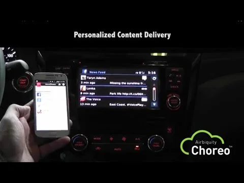
I worked with Nissan and Airbiquity to create a smartphone and automobile app that seamlessly and safely connected the user’s phone to their car, allowing them to listen to their favorite online radio stations, check facebook, easily find event locations and more. Created interaction storyboards for OOBE and wireframes for B2B and B2C web portals.
Here is a storyboard for the secondary, or guest experience. If the car is a rental, part of a fleet or borrowed, the driver still has the option of connecting their mobile device to the car.